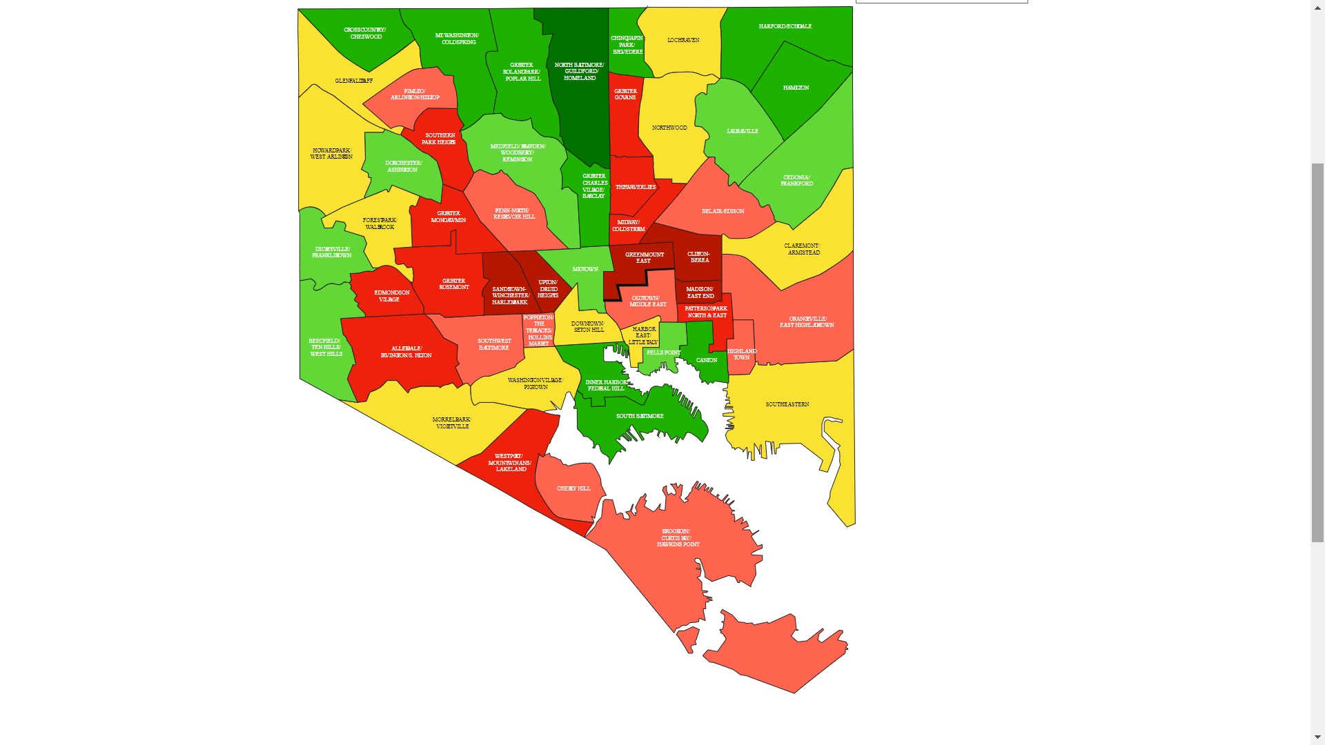
Dr. Lawrence Brown and his public health students have produced a fascinating map of Baltimore that illustrates historic and contemporary inequities. They’ve also produced a set of ideas that can help remediate these inequities:
In a hypersegregated city, segrenomics results in the redlining of majority Black communities and the greenlining of mixed-race and majority White communities. Our map seeks to reflect the status of power for each of Baltimore 55 Community Statistical Areas. The greener a community, the greater its access to capital and resources. The more red a community, the more it has been restricted from accessing capital and resources. Yellow communities are in the middle.
The Equity Baltimore Powermap is an analytical tool for community members, students, policy makers, and researchers to use to both understand the impact of segrenomics and work to change the trajectory of Baltimore’s redlined communities so that we can create a more equitable city for all. We utilize what we call Community Equity Metrics to illustrate the seven domains by which segrenomics has impacted communities—housing market, planning history, public safety & policing, education readiness, capital access, health, and transportation access.
The data is still in beta, but it’s interesting to see all of the different metrics explored. If you’d like to learn more about how Baltimore got this way, I can’t recommend the radio series The Lines Between Us enough.
Matthew Loftus
Matthew Loftus teaches and practices Family Medicine in Baltimore and East Africa. His work has been featured in Christianity Today, Comment, & First Things and he is a regular contributor for Christ and Pop Culture. You can learn more about his work and writing at www.MatthewAndMaggie.org